2021 Color Trends By Stacy Thompson
The New Year always brings about trends in color for the home, but the importance of color for 2021 seems to have even more meaning. After navigating 2020, our homes have become sanctuaries and safe havens. While color always has played a significant psychological role in our environments, we are more aware of the effect that it can have on our physical and mental health, after our collective experience. Everyone views color differently, so finding the right mix for your home is important, as your palette reflects your wants, needs, and personality.
|
Vibrant and Saturated
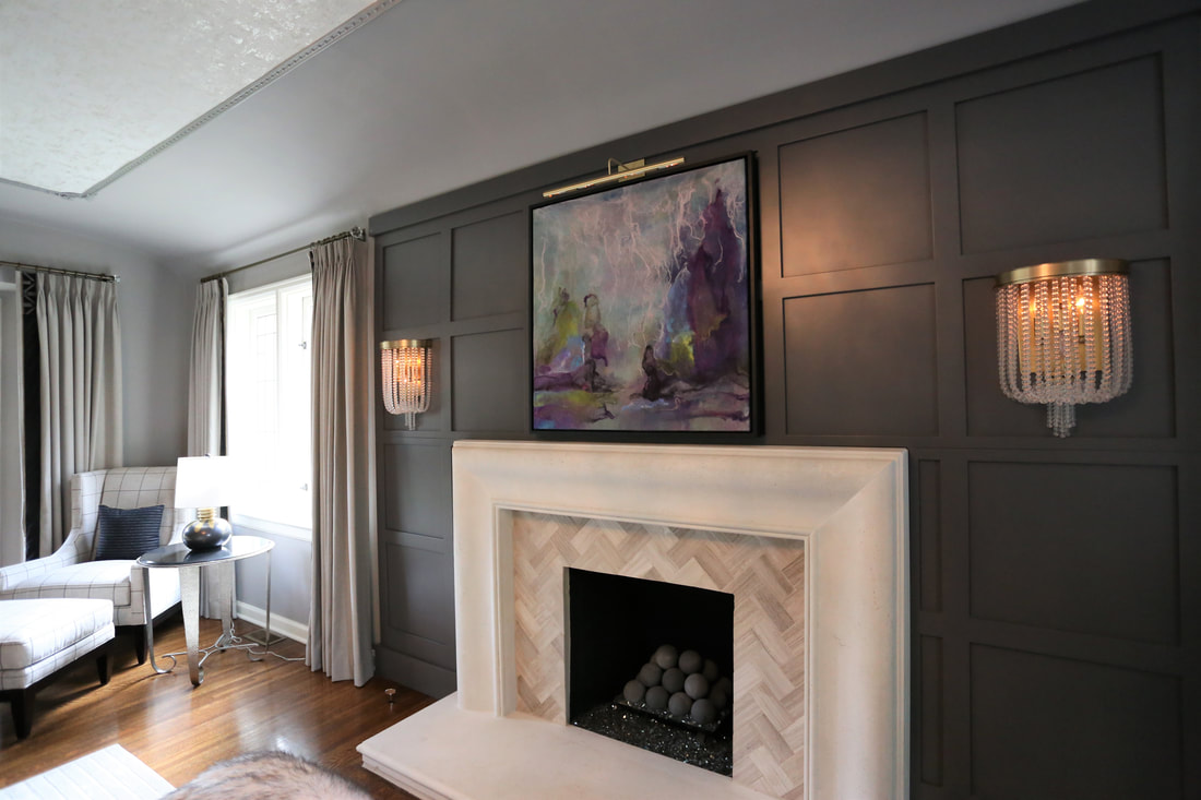
As an interior designer, I have seen what is on the horizon for color in 2021, and I think it makes sense for where we are as a society. Vibrant and saturated colors have been making a resurgence, but they are really coming in hot for this year. Rich, deep colors have a way of communicating warmth that can be a total mood changer. Dark blues, rich reds, bold greens, and even sunny yellows are making their way into homes, even if it is in furniture selections, fabrics, or accents. Homeowners want to bring in their favorite hues to tell their story and create a retreat that is undoubtedly a reflection of them. Finding feel-good joy is what we are all striving for, and color can help to reinvigorate our spirits. |
Tones of Nature
Going along with the tones of comfort of rich blues and greens, browns in all tones, from sand to chocolate, are coming into interiors, bringing a natural warmth. Soft, serene greens are a big player in the color forecast for this year, bringing the outside into our homes. Benjamin Moore’s Color of the Year is Aegean Teal 2136-40, which is a deeply soothing green-blue that evokes nature, while also promoting comfort. Retreating into natural colors has a calming and inspiring force that is needed to reset and reflect. |
Neutral Mood
Neutrals aren’t going away—they are here to stay—but they have changed from the cooler to the softer, slightly muddy color ways. Warm whites, like Benjamin Moore Simply White are still a favorite to balance out the darker moody tones in adjacent rooms. Olive, eggplant, adobe, warm gray-browns, and chalky blues have made their way into the new aesthetic of 2021. They are the softer side of the more vibrant tones, and perhaps easier to incorporate for those who might be a little color-phobic. Sherwin-Williams Color of the Year Urbane Bronze SW7048 is a deep, dark hue with a cozy, cocoon-like feel and a perfect balance with the warm white tones. Warmth and safety are reflected in the neutrals that are at the forefront this year.
Neutrals aren’t going away—they are here to stay—but they have changed from the cooler to the softer, slightly muddy color ways. Warm whites, like Benjamin Moore Simply White are still a favorite to balance out the darker moody tones in adjacent rooms. Olive, eggplant, adobe, warm gray-browns, and chalky blues have made their way into the new aesthetic of 2021. They are the softer side of the more vibrant tones, and perhaps easier to incorporate for those who might be a little color-phobic. Sherwin-Williams Color of the Year Urbane Bronze SW7048 is a deep, dark hue with a cozy, cocoon-like feel and a perfect balance with the warm white tones. Warmth and safety are reflected in the neutrals that are at the forefront this year.
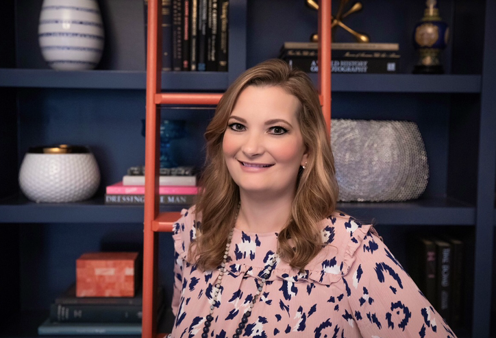
Whatever colors you choose to inject into your home, they should make you feel comfortable, as our homes are where we feel safe, where we make memories, and where are life unfolds. I am known for bringing color into my clients’ homes that personally connects to them. I mix in pattern, with fabrics, wall treatments, and furniture that speaks to a well-designed space that is uniquely theirs. I earned a Bachelor’s in Interior Design and have completed countless renovations and interiors projects throughout my 18 years in this industry. I am well-versed in the construction and design process and how the meaning of color can be transformative. Live colorfully!
Copyright © 2026 Pena Group, Inc. All rights reserved.


